"Holmesville...where everyone is home."
Originally, we were going to make The Lost Land of Yehey a children's book series because it seemed simpler and less daunting. But we rapidly realized that simplifying our story wouldn’t allow us to tell it faithfully. Plus, we didn't know a thing about breaking into the children's book industry! In fact, we had problems just deciding on what size to make the book. After a little back and forth, we realized that we should cater to our strengths, and firmly decided to produce Yehey as an animated series. It's a much bigger undertaking, but it made the most sense because we both knew way more about animation, and could deliver a faithful telling of the story with all the depth and heart it deserved. Also, we could get it to the world easier via technology and social media.
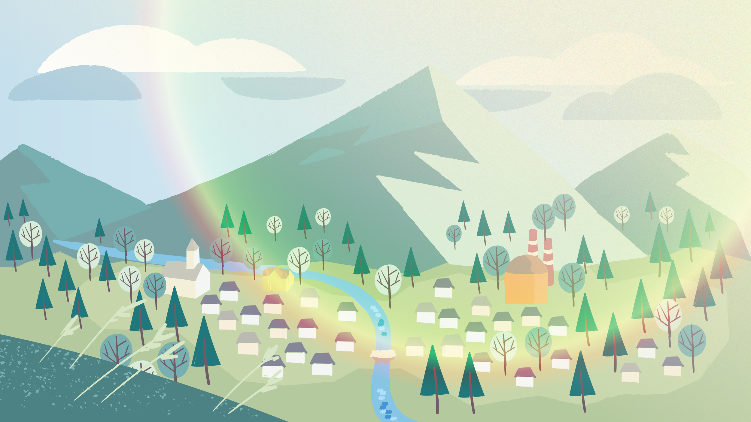
Below is the visual evolution of Holmesville, the town where Markus and Chechi live. The images compare the book version and the animated version of Holmesville.

Original storybook sketch

Final storybook version used in the Yehey Trailer
The book version of Holmesville definitely has a more hand painted and organic feel to it. Also the texture of the paper really gives it a look of authenticity . There is something charming about this version, and we tried to transfer that over when transitioning to the animated version.
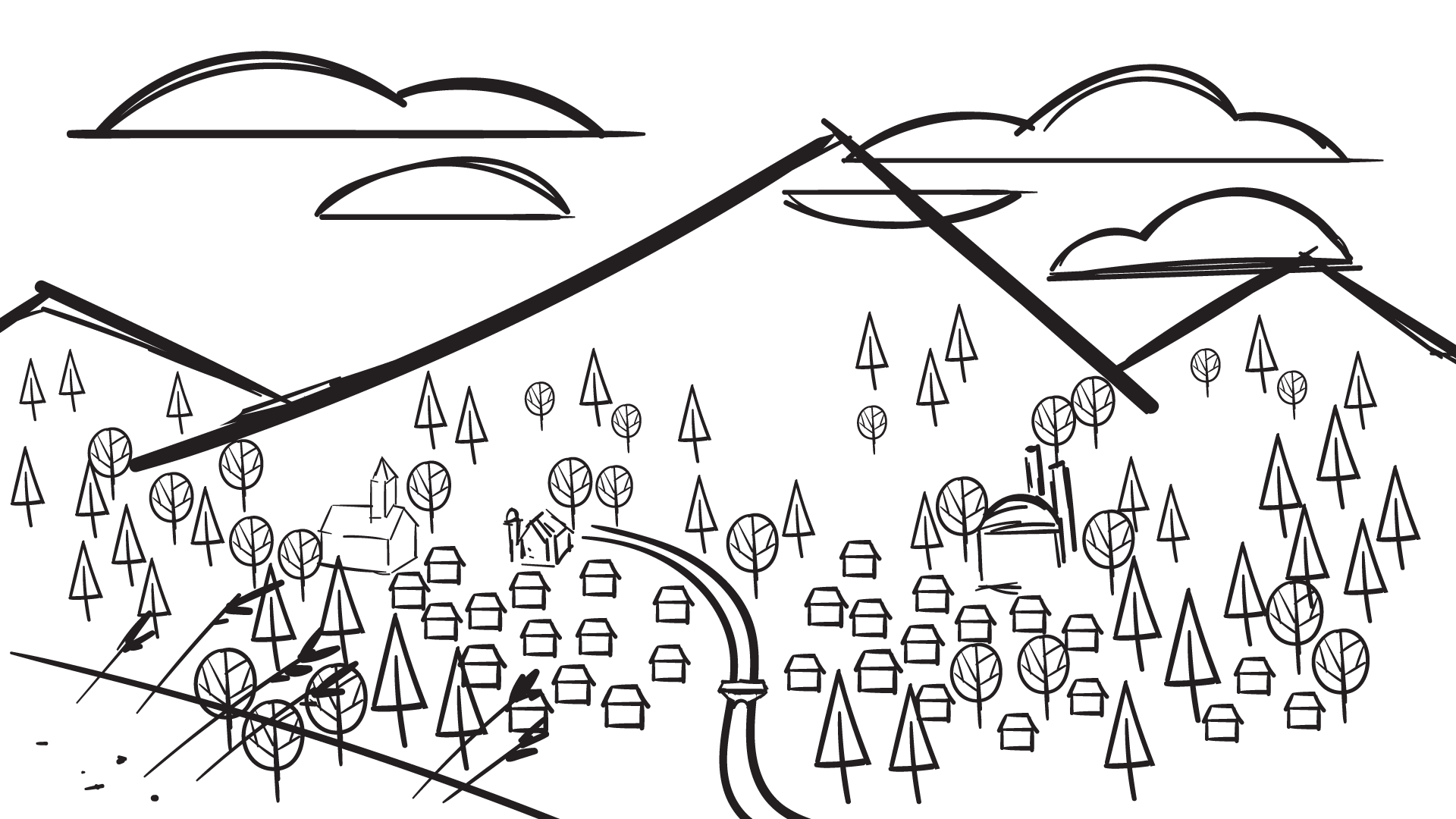
Animated pilot sketch

Final animated pilot version
The animated version received a bit of simplification to make production less daunting. It also received a bit of sprawling expansion across the valley floor. However the Holmesville Post Office is still in the same place, along with the Hobak Volleyball Factory and Lolo's house. Things get a bit cleaner and more geometric in this version. However we tried to retain that organic feel by adding simple textures to edges and large expanses of flat color. We also added a few lighting effects to warm things up...it's quite cozy.